Single KPI selected in the example below:
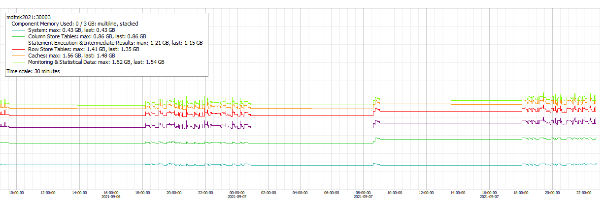
The “component” column used to split values into several lines on the chart. It is not really docummented, but come on, it is quite straight-forward.
There is a separate page documenting variables.
kpis: [
    {type: 'service',
        subtype: 'multiline',
        name: 'allocator',
        group: 'mem',
        sUnit: 'Byte',
        dUnit: 'MB',
        color: '#084',
        multicolor: True,
        stacked: True,
        sqlname: 'component_size',
        splitby: 'component',
        orderby: 'max',
        desc: True,
        legendCount: 6,
        others: False,
        label: 'Component Memory Used',
        description: 'Component Memory Used'}
]

sql: >
    select
        server_timestamp time,
        host,
        port,
        component,
        sum(exclusive_size_in_use) component_size
    from _sys_statistics.host_heap_allocators
    group by
        host,
        port,
        server_timestamp,
        component
    order by server_timestamp desc, component_size desc
multicolor
Set to true to assign colors based on “raduga” colors list from config.yaml
hashColorIndex
False by default. Set it true so the KPI color defined based on splitby value. This ensures consistent KPI coloring regardless of the orderby clause, as colors are mapped to the KPI name, not index.
others
When True - all the rest data will be summed into a single line named “Others”.
Possible orderby values: “avg”, “max”, “deviation” and “name”.
async
Initialy multiline KPIs were invented to split data from the exactly same timestamp into different lines. This is very tipical for statistics collected by the statistics server.
But sometimes data can be put into the same table with different timestamps (for example by different collectors), in this case the default approach creates very noisy and unreadable picture. v0.93 beta I required to use this feature.